
Color Scheming: Why I Chose a Home Color Scheme
Choosing paint colors, as I’m sure you agree, is one of the most fun and difficult aspects of home decorating. You get to play around with color and use your imagination. Plus paint collections have such creative names, who doesn’t want their walls tradewind blue or sea salt gray or indigo batik? But this is where so many of us get lost in the whirl of color and then our homes end up speckled like a rainbow with each space a different hue. I am totally guilty of this in past houses. With 515 Vista I am determined to stick to a home color scheme. So, today, let us discover the benefits of choosing a color scheme when picking paints for in your home.

Harmony
One of my main goals for the decoration and design of our new house is to have cohesion and harmony throughout the spaces. This doesn’t mean boring rooms or white-washing the walls. But it does mean selecting a color scheme for the whole house. I also know that my furniture and accessories will be on the eclectic side with a mix of modern and antique pieces. A home color scheme will counteract this mix to create harmony.
The colors I’ve selected are on the cool side with blue predominating. I like the calming effect of blue, and according to Feng Shui it is supposed to inspire confidence and wisdom. Well, we could all use a little more of that!
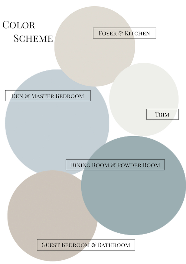
The colors are all from Sherwin Williams HGTV Home Collection at Lowe’s. They are basalt powder, tradewind blue, interesting aqua, into the gloaming, and fundamental white.
Flow
In terms of room layout, our new house is very traditional. Open concept was not on the agenda when this house was built nor are we planning on opening up many walls. We like having separate areas for the formal living room, office, dining room, and den. But I still want the spaces to flow, and with all of these spaces so clearly delineated color is the main way I can achieve that flow. This will also aid in creating harmony.
Tranquility
If I use a home color scheme to create harmony and spaces that flow in 515 Vista, then I will also have a tranquil home — at least in terms of decor and design ; ). I believe a home should be tranquil and restful — a place to recharge. I also think this is important to making a gracious home. One that is welcoming and open to guests.
Value
Finally, there is a bottom dollar consideration. Neither S. nor I think this is our final, long term home. We will want to re-sale it in a few years, so all our choices have to take that into consideration. As most realtors will attest, it is much easier to sell a home with a more neutral color scheme and spaces that flow.
Ready to adopt a home color scheme? Read This Post for 5 Steps to Choose Your Colors! Or let me personally help you select and implement a home color scheme! Email me to set up a color consultation – penderandpeony@gmail.com.
Check out all the home styling services I offer here.
I also have this free Home Color Scheme Worksheet. In just 5 Easy Steps you will have your colors selected!

Ready to implement your home color scheme? Read THIS!
*This page contains affiliate links*
Images (Left to Right):
Bedroom via Real Simple; Leta Austin Foster via Vintage Mulberry; Heather Scott Home & Design via Home Bunch; Dining Room via Vintage Indie
Partying at Make It Pretty Monday – Remodelaholic !

Hi there! I'm Katherine...

the curator, writer in residence, and decorator behind Pender & Peony.
I’ve decorated my entire 1960s brick colonial with secondhand finds and antiques on a budget without sacrificing style, quality, or comfort.
You CAN have a traditional home with timeless charm on a budget too!
The problem isn't your taste -- it's an industry that glorifies the next big trend and only showcases high end custom design.
That's why I created The Collected Room Method to teach you my approach to the collected interior!
Thanks! Be sure to sign up for the P&P Social Circle. You will get the weekly post digest and exclusive downloads!