How I Put Together a Room Color Scheme
5 strategies to create a room color scheme for a traditional collected interior!
You know those rooms that look straight out of a furniture brand’s catalog? Every hue is perfectly matched. Every piece of wood furniture has the same stain. BORING! Those spaces do not look organic or collected.
When you decorate slowly overtime, hunting and gradually acquiring new (or new to you) pieces like most of us do the colors in your room won’t always be a precise match. That’s totally OK! If there is no variation in hue, the room will feel rather flat.
If you love classic design and traditional interiors with Grandmillennial vibes, you want a room color scheme that is just right but NOT perfect! A scheme that is perfectly imperfect if you will…
I embrace slow design and the often years long process of decorating a space with secondhand finds, antiques, and other bargain buys. When decorating like this your color scheme is important to bring cohesion and harmony to an often eclectic space. You have to keep it at the forefront of your mind and be able to make quick decisions about estate sale finds before they get snapped up by someone else. I use 5 key strategies to create my room color schemes, and I hope you’ll find them helpful too.
I’m not delving into color theory and the wheel because I don’t think many of us really use that to get inspired, but I will say knowing the principles can be beneficial, especially if you find yourself debating between colors or trying to balance out a scheme. Here is a good resource for learning how to use the color wheel.
Starting a Color Scheme
First off, I want to talk a bit about how my room color schemes start. Every room needs an inspiration keystone whether it is an idea, a theme, a pattern, an artwork, a rug, there must be some piece that lights your fire from which you can build a room. You may hear this piece called the hero, and it usually is the star of the space. Once you decide on your hero piece, the rest of the decorating process can really snowball your decisions. But this piece takes significant consideration and you must commit to it.
Hero vs. the Glue
What I don’t hear many people talk about is the “glue” piece. This is usually a patterned piece with multiple colors that acts as the glue for the whole room. Sometimes your hero and your glue are the same, but not always. Let’s use our most recent decorating project – my nursery design for baby boy James – to explore this idea.
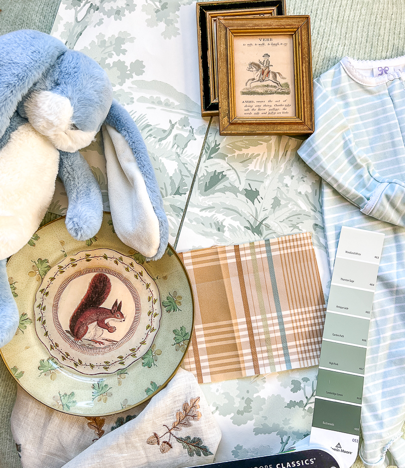
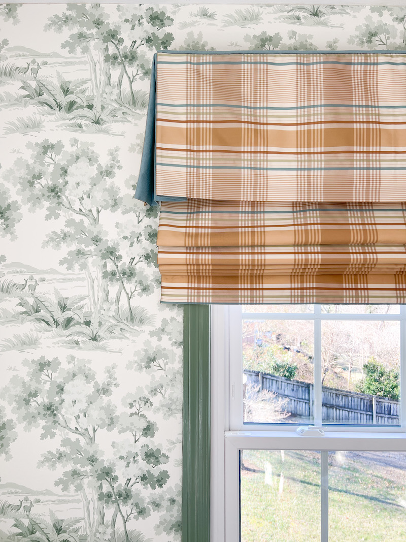
This room started with the Countryside Morning wallpaper from Borastapeter. It is the hero design element. The pattern is a lovely toile that shows big trees, draping bushes, and two sweet deer in soft greens with a white background. I fell in love with this quaint pattern and felt the greens were so soothing — just right for a nursery. But you can see that there are 4 shades of green in the pattern and no other colors. I didn’t want to limit myself to a green and white room, so how did I bring in other colors and make it harmonious?
I chose a glue piece that coordinates with the hero and opens the design to other colors. For the nursery, that glue is the plaid fabric in taupe, tan, blue, and green from Thibaut. Now you are probably wondering how did I select that fabric and how did I build off of it?
Well first I knew I wanted a plaid fabric to contrast with the organic shapes in the wallpaper and to further the “country” theme. But to decide which plaid in which colors that’s where my 5 strategies for a room color scheme come into play. Let’s delve in…
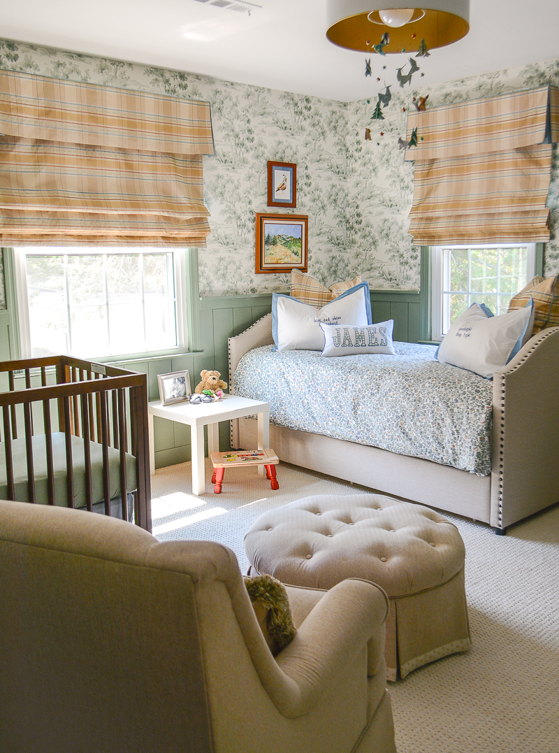
See the full nursery reveal here with sources linked.
How to Create a Room Color Scheme
Strategy 1 Match Undertones
What are undertones? These are the subtle colors that underlie the main color. Let’s take blue for example…blue is surrounded by green and purple on the color wheel. If you add green to blue you move towards aqua and teal a green blue. But if you add red then you make the blue more violet, injecting warmth into the color. More on undertones here.
An important first step to building your scheme is to identify the undertones. The greens in Countryside Morning have blue undertones, which also makes them cool greens. So when selecting a blue to pair with the wallpaper, I needed one with green undertones. Make sense?
These greens are also very muddy in tone, meaning they have a lot of gray, so it was also important to choose other muddy colors to complement. Learn more about that in this post. The Thibaut plaid has the right version of blue and green to coordinate with the wallpaper, and I decided to use it in a large dose for the Roman shades.
Paint decks can be surprisingly helpful in determining your undertones even if you don’t plan on painting the room. Get a basic fan deck from your favorite paint company and play a little game to find which color strip best matches your hero piece. Then look at the strips around it to compare colors and see the undertones.
It’s not that you can never mix colors with different undertones, but I find more often than not coordinating the major colors in a scheme by undertone creates harmony.
Strategy 2 Consider Color Temperature
We all know certain colors feel warm or cool, and this temperature can greatly impact a room’s energy, making it feel warm and inviting or cool and soothing. I find my favorite traditional interiors blend cool and warm colors together in a delicate balance.
Having selected cool greens and blues thus far, I worried the baby’s room might read icy and reserved, so I wanted my glue piece to inject some warmth and keep the space balanced. The plaid I chose does that with the warm tan and brown stripes, but it also has a grayish taupe that connects to the cool blues and greens. PERFECT!
As you put together your own color scheme check in on the colors’ temperatures. Are they all cool or all warm? Does this create the feeling you want for the room? Don’t forget warmth can always be injected by a deep brown wood floor or furniture, and you may not need to add warm hues if your furnishings incorporate wood tones.
Strategy 3 Bring on the Neutrals
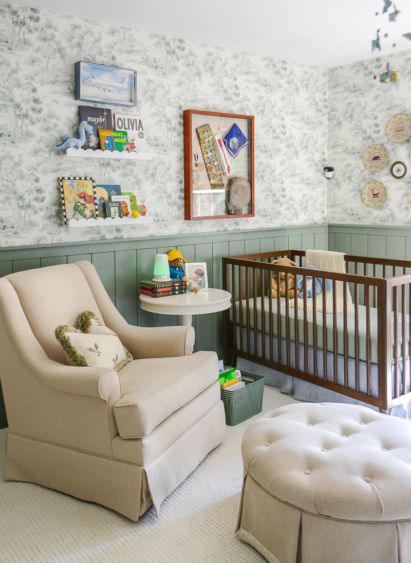
Unless you are a color maximalist and you enjoy being bombarded by a lot of color, every room needs a healthy dose of neutrals. They give your eye a wonderful rest from the bright colors and help patterns mix well. Because the walls, window treatments, and various kids toys are patterned and colorful, I knew I needed a strong dose of neutrals to balance out that busyness.
I brought in that dose with beige carpeting and furnishings in the nursery.
Strategy 4 Don’t Ignore Contrast
This is something we instinctively know, but perhaps think little about. If you want something to really be seen, it has to contrast with its background. Look at some of your favorite patterns. I bet they have white or light colored backgrounds with darker design elements. This helps provide a neutral ground for the pattern to pop. Apply this concept to your room color scheme unless you want a single color drenched monochromatic look.
Incorporating contrast in your color scheme doesn’t have to be as black and white as well black and white. You can achieve contrast with a smaller range of difference, but the variation in light and dark is more visually interesting.
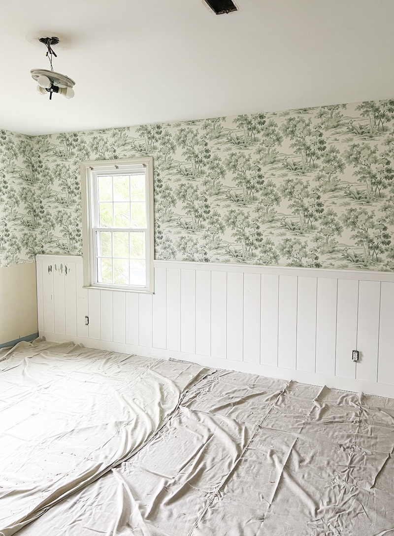
As I shared the nursery renovation progress, and specifically this photo of the shiplap in its original white state, I got a number of comments that I should leave it white. The problem with white shiplap in this case is… I had already committed to beige carpeting and upholstery fabrics, so all that light color and white would have washed out the bottom half of the room. Everything would have blended in and been a bit boring in my opinion. The shiplap had to go green (BM High Park) to provide contrast.
It also had to go green because I don’t enjoy spaces with too much white. I find them cold and sterile…the last feeling I want for my baby’s room!
Strategy 5 Throw in an Unexpected Hue
This is an ancient design technique and it will help you achieve that perfectly imperfect color scheme for your space! Use a pop of color that is outside your color scheme and feels just a little bit jarring. If you are a TikTok fan you probably know about the “unexpected red theory,” but long before this catch phrase, designers having been using this trick. A little pop of red or other color that contrasts with your scheme is just a happy surprise that livens up a space.
I did use little pops of red in James’ nursery with some decor accents like the stool legs and the books. Red works in this space because it is green’s complementary color.
Well Peonies…I hope this post helps you with your next decorating project. Choosing a room’s colors can be complicated and daunting, but these 5 strategies will help you narrow down your choices and make smart decisions for a beautiful space.
If you need help pattern mixing, don’t miss this blog post!
