
Pattern Play: It’s a Conversation
5 strategies for mixing and matching patterns to decode pattern play and create pleasing combinations!
Patterns should have a conversation with each other, and if it’s a good conversation, there is a lot of give and take — back and forth between the two. You know the kind of conversation I’m talking about…
The one that lasts hours but only felt like minutes…
There’s usually a good bottle of wine involved…
And great music humming in the background.
In this kind of conversation, commonalities emerge and coalesce, but it gets truly interesting when there is debate and difference too. For patterns to work together they have to feed off each other just like a good conversation does.
While a room with only one pattern can certainly be appealing, rooms with multiple patterns mixing and matching is so much more interesting and charming to me. But I get it…figuring out which patterns to pair and in what colors can be daunting, while the trial and error process can get expensive and frustrating.
Remember all pattern play is about pleasing the eye! Yes, everyone’s eye is different according to taste and our own unique visual history, but for the most part we don’t enjoy when patterns clash and a room feels manic. There have to be areas of rest.
There are “rules” to pattern play, and we are going to discuss several of the ones I find most helpful, but let’s call them strategies. I don’t think of them as rules, and you shouldn’t either. Instead they are tools to help you create failsafe combinations and guide your process.
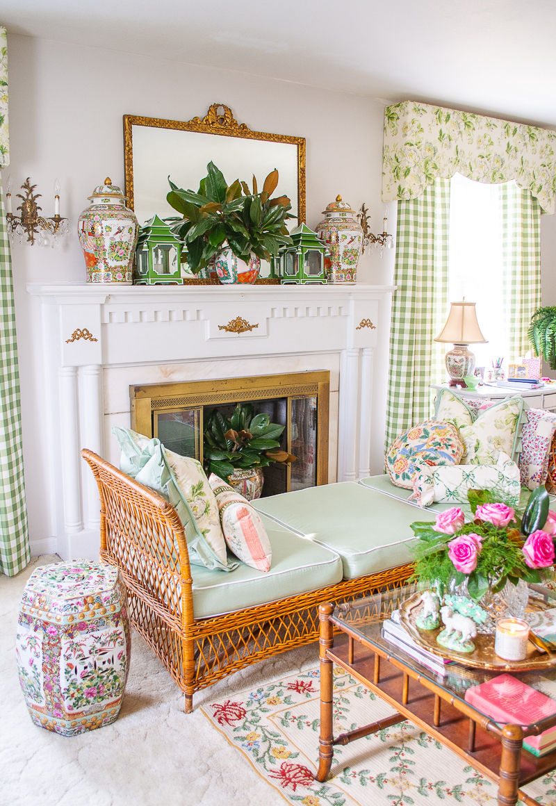
To look at these strategies, I’ll be using the pattern mix in my formal living room. You can see the whole space in this blog post.
Pattern Play Strategy 1
Use color as a connector and then introduce differences with shape and scale
This is strategy number one because I use it the most and it can be applied no matter your style or design aesthetic. If you take my metaphor for pattern play as a conversation, a really good one, then color is the commonality between the friends and differences occur with the shapes of the patterns and the scales.
Think of the shapes of the patterns as organic (curving natural lines like florals or ikat) or geometric (uniform more linear lines like stripes or trellis).
Scale is the size of the pattern elements. Are the elements small —an inch or two big? Or are the elements large — several inches big? When buying fabric online always examine the image with the ruler laid out on top of the fabric to get a sense of scale.
Pair an organic pattern with a geometric one in the same colors but with different scales. The patterns will feel connected because of the color but with enough difference to keep it visually interesting and not go over the top.
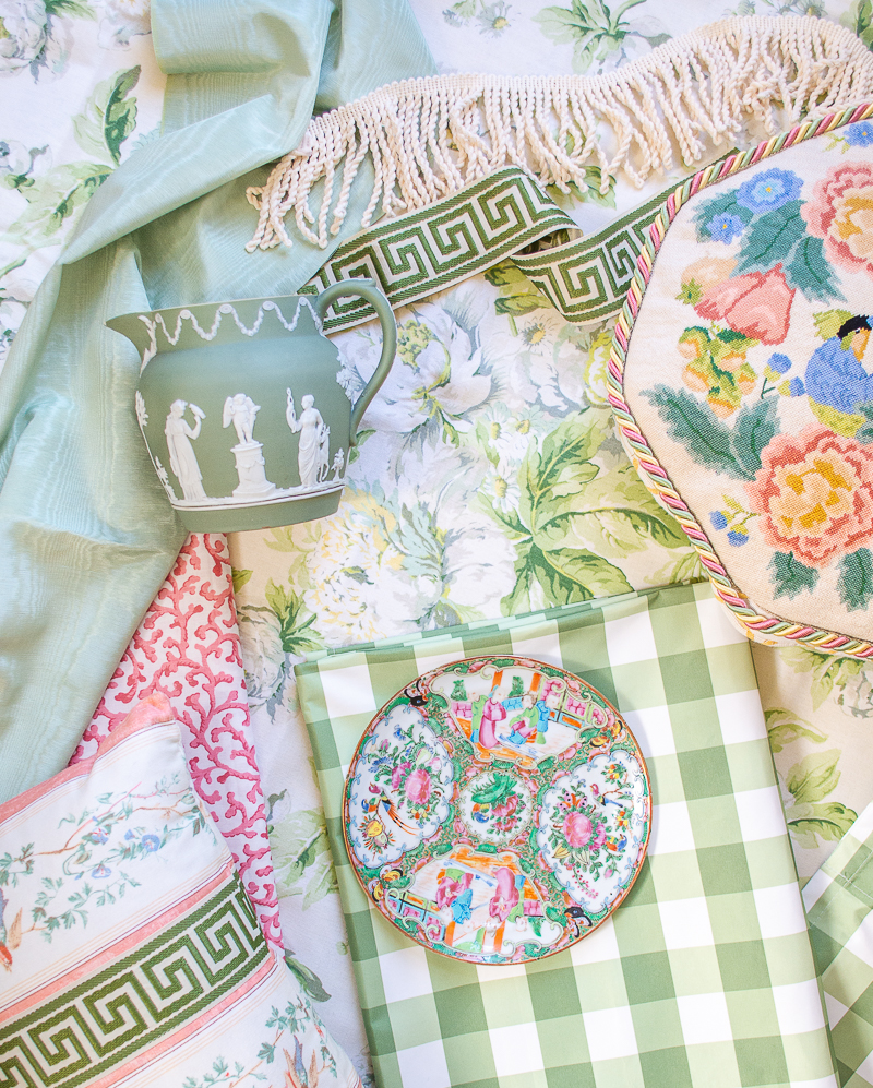
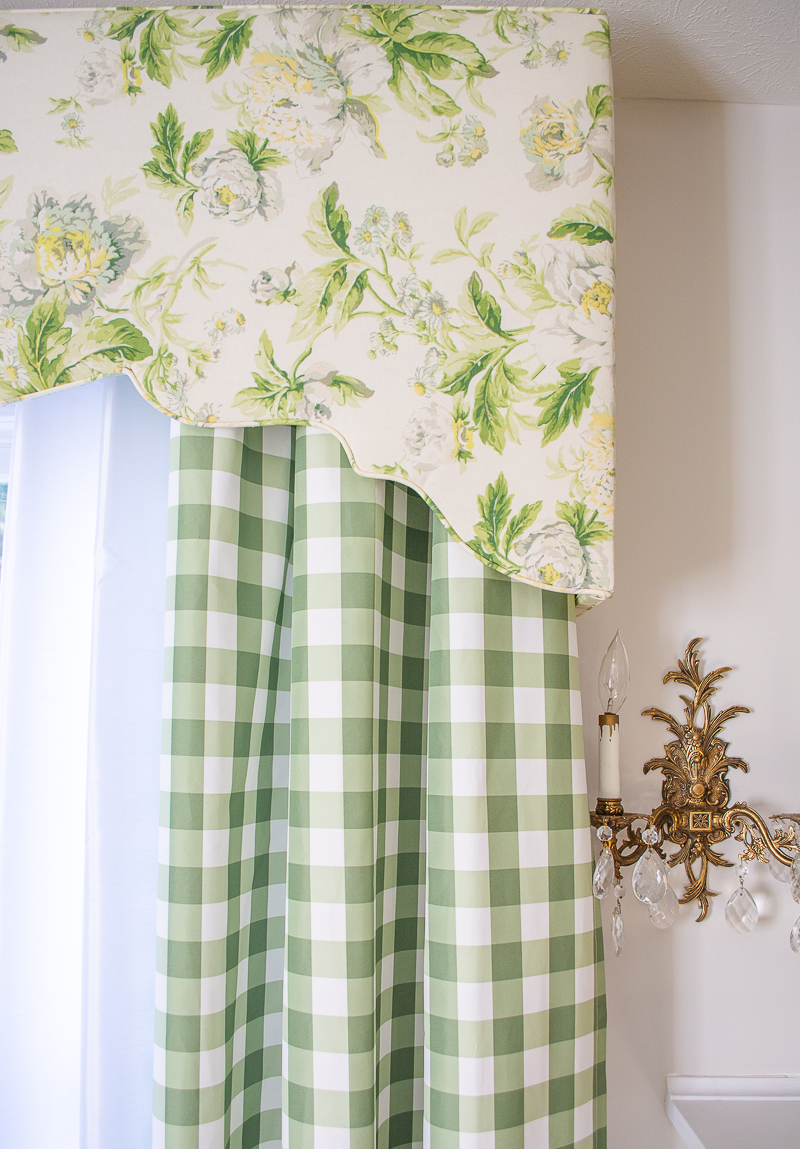
Take a look at my window treatment patterns: a large scale floral chintz and a classic gingham.
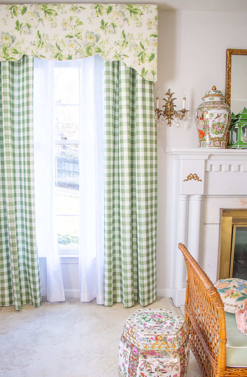
P.S. the green and white gingham is just an inexpensive curtain from Walmart! Shop here.
Why does it work so well? Because I’ve mixed a large scale multi-colored floral with a smaller scale geometric in the same colors.
Pattern Play Strategy 2
When in doubt use the tried and true formula:
Large Floral + A Geometric + Small Subtle Pattern
This strategy builds on the first one, pairing geometrics with organic patterns, but it introduces a third that balances the scale. You are varying the lines, mixing straight and curved, and the sizes of the patterns.
Once you start paying attention to this pattern formula you will start to see it everywhere because it’s dependable and pleasing to the eye.
Color is still an important connector, but you don’t have to stick to a monochromatic palette. If one of your patterns is multi-colored, use that to determine the other patterns’ colors.
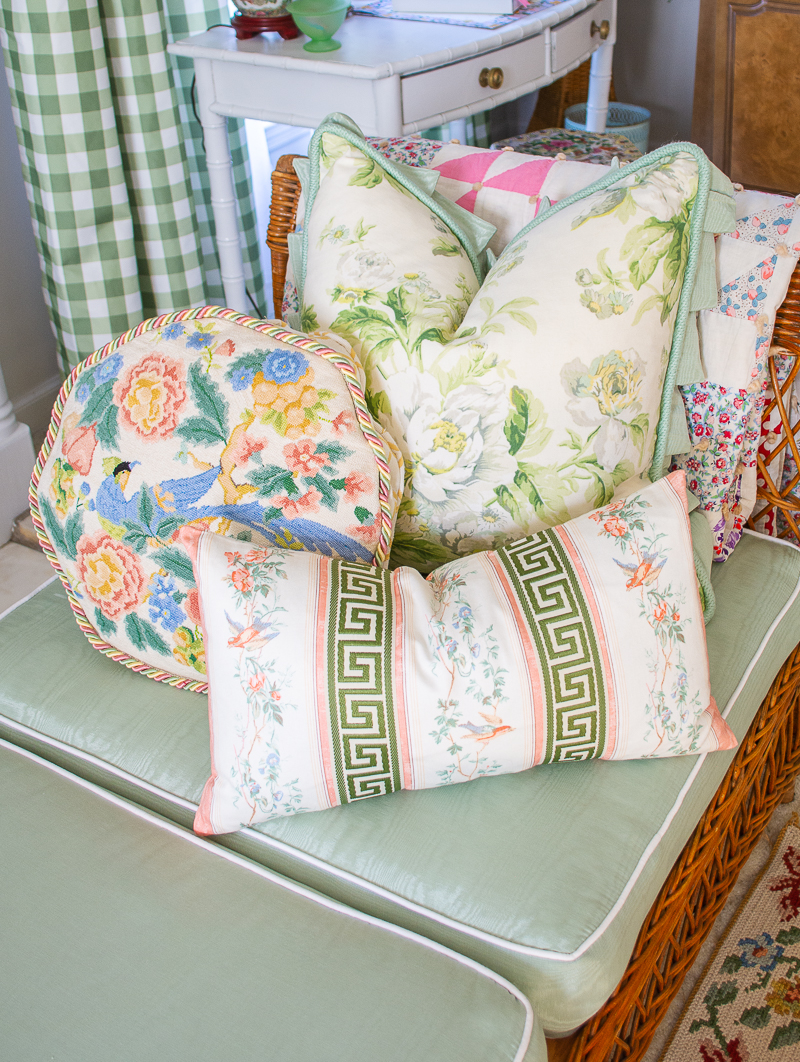
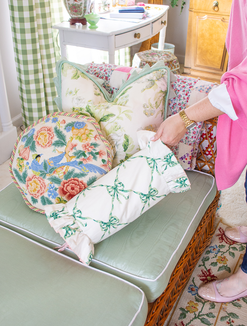
In this trio of pillows, I’ve used the formula albeit more loosely. The green and white chintz is the large floral. The needlepoint Chinoiserie bird pillow takes the scale down and creates contrasting color, while the small rectangular pillow introduces a smaller more subtle print with a geometric Greek key.
Pattern Play Strategy 3
Work with a lead pattern
Choose a multi-colored, bold pattern that directs all the colors and other patterns for the room. This lead pattern should have at least 3 different hues and a neutral tone within the pattern. Think big bold chintz, Chinoiserie toile, Bohemian ikat, or a playful stripe for your lead pattern.
The lead pattern doesn’t have to be a textile. It could be a favored Chinese porcelain or an artwork. Make sure it is interesting enough and you love it enough to inspire the room!


In my living room, the lead pattern is the Waverly chintz Fleuretta Spring (sorry it is discontinued). It formed the basis for the room’s color palette and dictates the pattern pairings. Though, take note, the chintz is not everywhere in the room, instead it is featured on a few key pieces: the cornice boards and my daybed pillows. But because the room’s patterns and colors are based around this chintz, everything feels coordinated, and the accessories can move to different spots and still work.
To make the lead pattern strategy work for you try creating a schematic for yourself like I did below. Here is the chintz in my living room paired with a variety of other patterns within the 3 main styles: geometrics, organics, and small scale. I pulled out the coordinated colors directly from the chintz then paired those colors with their contrasting hues from the color wheel in tones appropriate to the pastel colors I love.
You can see how a variety of differing patterns could be combined to compliment the lead chintz!
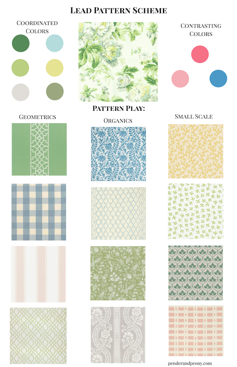
Similar Chintz: Waverly // Yellow & Green Floral // Waverly First Lady // Sanderson Green & White
Geometrics: Green Fretwork // Blue Gingham // Pink Stripe // Green Trellis
Organics: Blue Floral // Blue Ikat // Green Floral // Gray Floral
Small Scale: Yellow Coral // Green Ditzy // Green Leaf // Pink Block
Pattern Play Strategy 4
Use a style or time period to dictate patterns
If you are attracted to a particular design style or time period for decor, choose patterns that are characteristic of that style or period. With this pattern play strategy you don’t have to reinvent the wheel!
Gather your inspiration images that represent this style or period and look at the pattern combinations there. Take note of the color pairings and how the patterns are used within the room. Are they close together or spread out. You will want to replicate these colors and positions.
Working in the Grandmillennial style, I am very partial to preppy plaids and stripes as well as bold florals and feminine bows, so these patterns are frequent combinations in my designs.
Pattern Play Strategy 5
Create balance with neutral grounds, solids, and textured solids
Remember at the beginning of this post when I said pattern play is about pleasing the eye. Well your eye doesn’t like bouncing around willy nilly. It likes direction and moments to rest. When you pair too many patterns together with the same shapes and the same size elements they tend to clash because each one is vying for your eye’s attention. The combination will feel too busy and your eye keeps bouncing around not having a moments respite.
Instead you need balance! Pairing curved lines with straight lines helps your eye move from one element to the next, and the different scales help create that balance.
The other key is to break up multiple patterns with solids and textured solids. In my living room I use a celadon moiré fabric as my textured solid. The color pairs beautifully with the chintz and provides a soft background for the other patterns to shine.
You’ll also notice that all of the patterns in this space have a white ground that just means that the background to the pattern is white or a soft cream. Choosing patterns with the same neutral ground will help tie them together and keep the pairings from feeling too busy.
One final point to consider when balancing your patterns is how close they are to each other. When patterns are right next to each other, like pillows on a sofa, the patterns have to harmonize well, but if they are across the room from each other you don’t have to worry as much about the contrast and scale. Continue, though, to use color as your connector.
————
I could go on and on about playing with patterns, but any of these 5 strategies for pattern play is a good place to start when choosing fabrics and decor. At the end of the day, remember to have fun and mix patterns that appeal to you.
Hi there! I'm Katherine...

the curator, writer in residence, and decorator behind Pender & Peony.
I’ve decorated my entire 1960s brick colonial with secondhand finds and antiques on a budget without sacrificing style, quality, or comfort.
You CAN have a traditional home with timeless charm on a budget too!
The problem isn't your taste -- it's an industry that glorifies the next big trend and only showcases high end custom design.
That's why I created The Collected Room Method to teach you my approach to the collected interior!
Thank You so much for this useful guide and eye candy pics. I will definitely review the content repeatedly over coming weeks! Keep up the good work!
So glad you found it useful! Happy pattern playing!
What a delightful article with valuable information! Could you tell me what your living room green gingham fabric is? Lovely room!
Thanks Beverly! The green gingham curtains are actually just cheap pre-made curtains from Walmart…can you believe it! Here is the link to shop, but I think they are sold out of the green currently: https://shopstyle.it/l/bFASC