
Why I love Muddy Interior Paint Colors
The benefits of painting your interior with a muddy or muted tone and how to pick these subtle colors!
Have you ever heard someone talk about dirty versus clean paint colors? Maybe they used the word muted or muddy to describe an earth tone? What they were describing is the chroma of a color – the saturation. The higher the chroma of a color the more pure or “clean” it is, while the lower the chroma the more gray is mixed in with that color. These variations of a color are called tones in the paint and design worlds, and they are a desaturated version of a color that feels more muted or muddy.
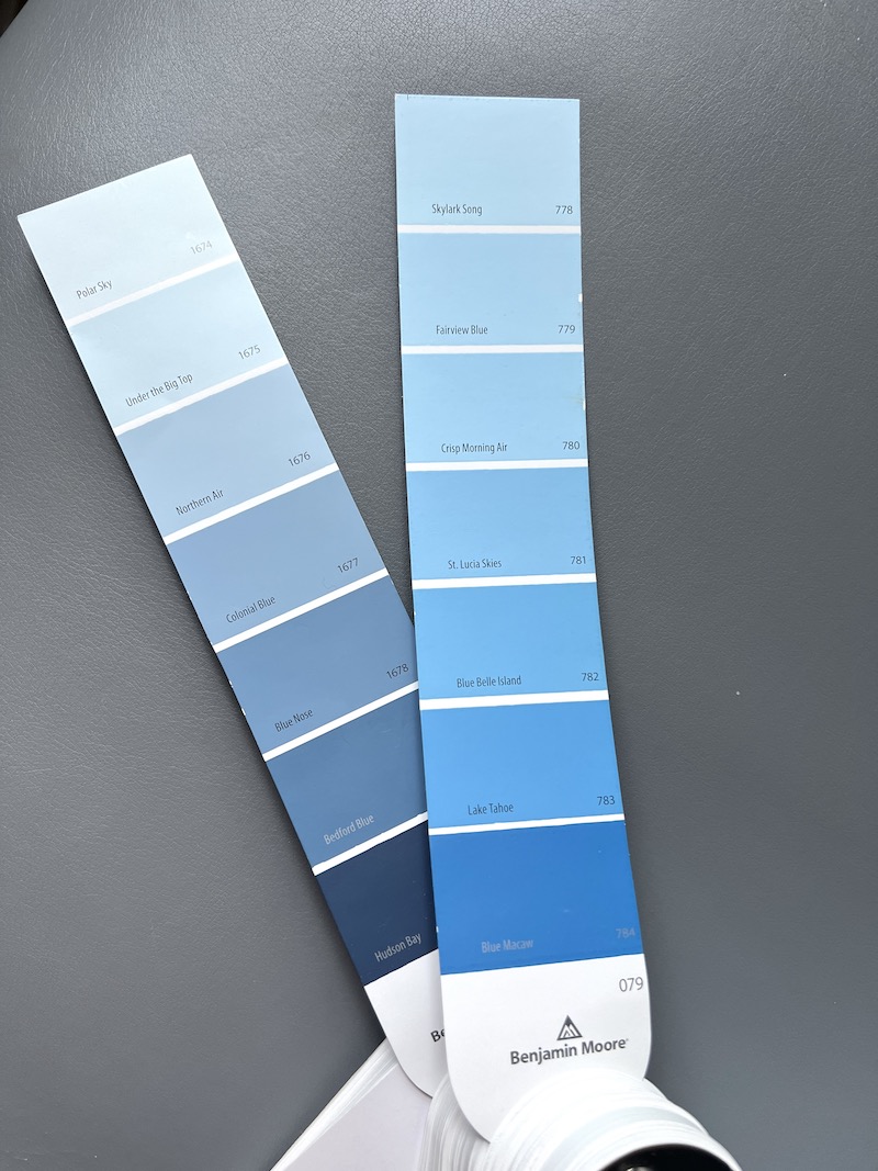
Take a look at these two strips of blue. See how the one on the left is more grayed than the right one. It has the muddy tones and the one on the right has the more pure colors.
There is some debate in design over mixing “dirty” colors with “clean” ones in the same room because often when you put the tonal color (desaturated one) with the pure color side by side the tone will look really dirty not merely muted. And no one wants their brand new paint job or upholstery to come off as dingy! To avoid this consider the chromas of colors when creating a scheme and try using colors with the same dose of gray. Take a look at the iconic lobby of the Greenbriar in this image:
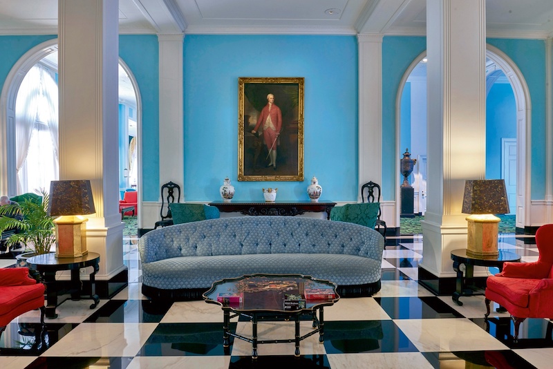
PHOTO: MICHAEL ARNAUD, DOROTHY DRAPER & COMPANY, INC. Image via Galerie
See how the steel blue kidney sofa is a muted tone that looks kinda dingy when backed by that vivid “pure” aqua. Now this maybe a trick of the lighting and photography, but this photo really shows how a “clean” color can totally depreciate a muddy one into the drab zone.
Working with color is always a balancing act of comparison. A color alone may not appear muted or its undertones may not stand out until you place it next to another color and all of a sudden the first one changes. Colors frequently take on new characteristics when you change the light source, so always be careful to view a paint or fabric sample in the room it belongs with the various lighting scenarios.
Tones also get a bad rap from designers who say they lack energy and don’t feel fresh enough. I say fa! A muted paint color can bring complexity and subtle nuance to room to create a truly elegant space. Muted does not mean dull!
Here’s why I love muddy interior paint colors:
No. 1 Add Softness
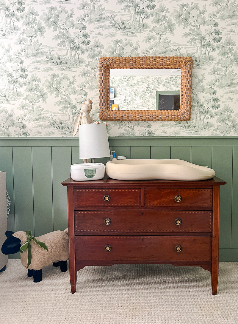
A muted tone of paint doesn’t mean you can’t get a strong arresting color on your walls. But by turning down the dial on the saturation and introducing gray the color will have a softness that feels relaxed and approachable. This is particularly good for rooms you want to feel cozy and comfortable like bedrooms and living rooms. Our nursery is painted in Benjamin Moore High Park, which is a sage green with lots of gray. You can see it really grounded the white and green wallpaper, making the space feel softer and warmer.
No. 2 Subtle
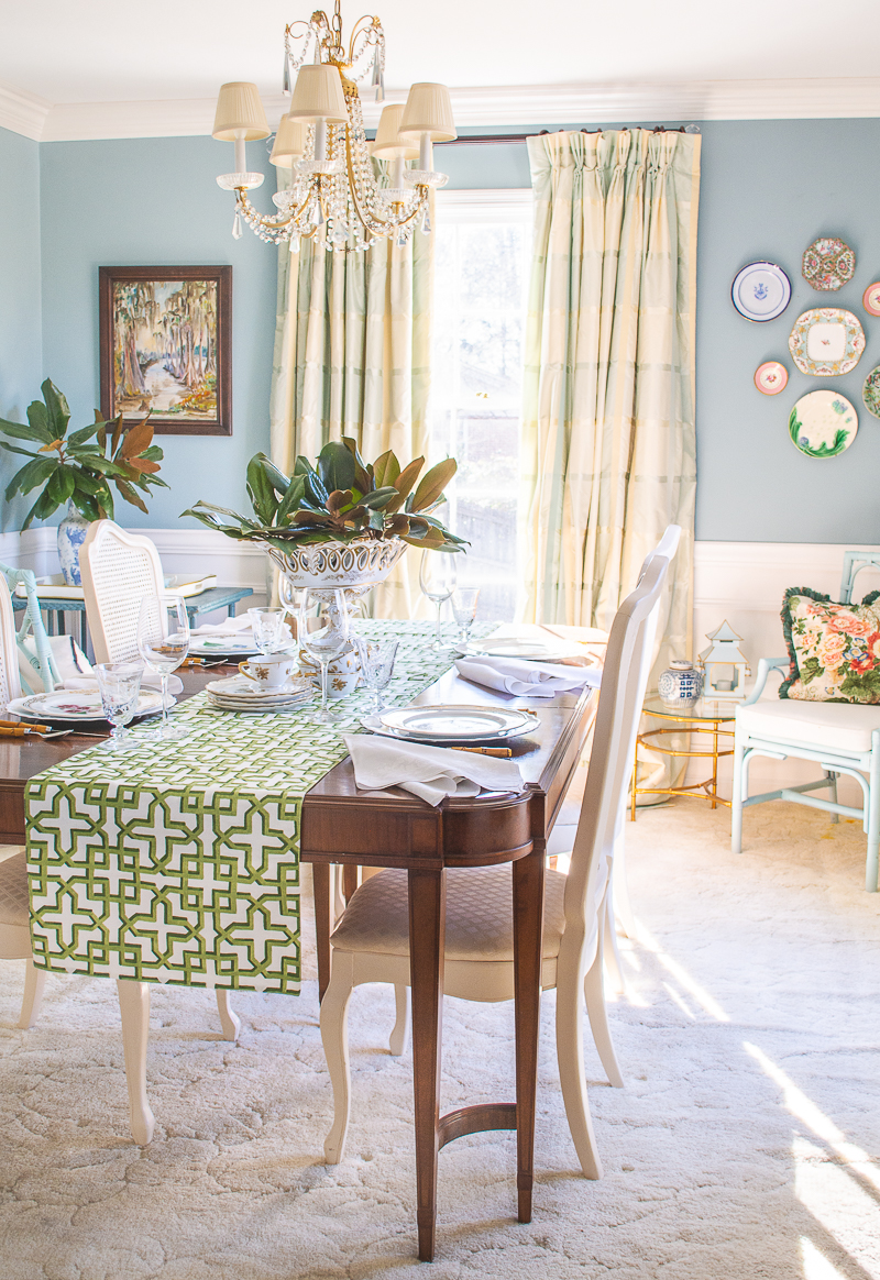
I often find the tone of a color so much more elegant because it is subtle. It doesn’t slap you on the nose with its exuberance, instead the muddy color offers a more complex invitation. This can be a great choice if you are new to decorating with color or feel unsure about bold hues. Our dining room is painted in Interesting Aqua from Sherwin Williams. It is a blue green with gray tones that feels colorful but understated, which is exactly what I love for a dining room where you want to set the stage for wonderful gatherings.
No. 3 Calming
Along with the temperature of a color its saturation can have the strongest impact on whether the paint feels bold and invigorating or calm and soothing. Often a muted hue reads more earthy, and, thus, more calming. When choosing interior paint always consider what how you want the room to feel. If calm is your goal, go muddy!
No. 4 Work Better in Large Doses
It’s natural when you really love a color to be attracted to its cleaner more pure hue on a paint swatch, but when you start washing large sections of your room in that pure hue it becomes overwhelming. This is particularly true of yellow. A pure yellow can look so cheerful and fun on a paint swatch, but when you paint that version on your walls all of a sudden you are living with a school bus. So choosing to tint up (add more white) or tone down can get you a better version of yellow. Just take a look at my guest bedroom…
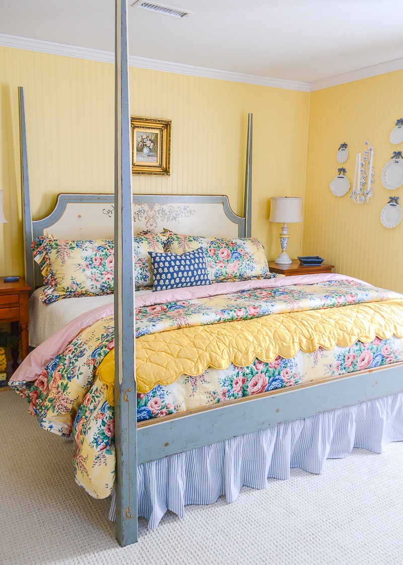
It is painted in Squish Squash from Benjamin Moore. This version of yellow has a subtle grayish tinge that mellows the color making it cheerful and pleasant for a bedroom.
No. 5 Provide the Perfect Backdrop
Muddy paint colors can provide the perfect backdrop to let art or furniture sing. Sometimes you don’t want your wall color to be the first thing that catches they eye in a room. Instead you want your meaningful art collection to stand out or a special upholstered piece to take center stage. When this is the case, I usually choose a softer more muted tone.
Ok! You’ve convinced me, but how do I know which are the muddy colors?
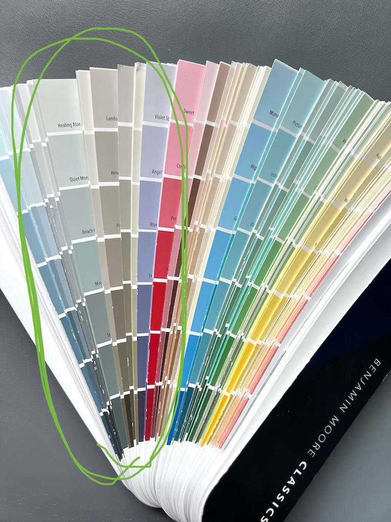
Muddy tones are mixed throughout a fan deck, but usually there is a section of the deck for neutrals or tones. When you look at this section you’ll see an assortment of all the hues, but compared to the rest of the deck they will look more muted. Here they are on the Benjamin Moore classic’s fan deck:
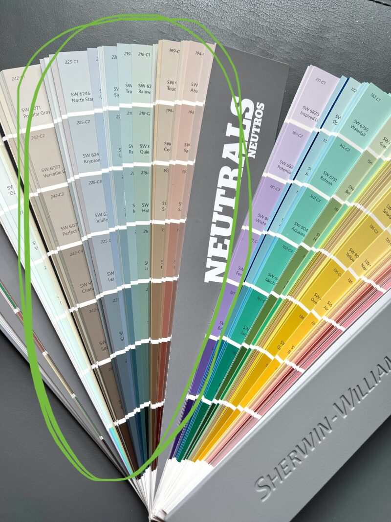
Here they are in the Sherwin Williams basic deck under neutrals:
You can also make muted or muddy colors by mixing opposites on the color wheel together, so remember to compare colors to each other to find the right muted version. Most fan decks have the base more pure color in the center of the strip and tints go up (this is the color mixed with white) and shades go down (this is the color mixed with black), but you will find gradations of muddiness within the main section of the deck.
Also check out Encycolorpedia for more information about any paint color you are considering. It will show you the gradations and similar tints or shades.
When using muddy interior paint colors always consider how the shadows in the room will increase the darkness of the tone and further desaturate the color. Those shadows may also bring out unwanted undertones. Don’t forget the “clean” versus “dirty” juxtaposition. Keep your muted tones interesting with layered pattern and texture.
Do you prefer muted interior paint colors too?
Hi there! I'm Katherine...

the curator, writer in residence, and decorator behind Pender & Peony.
I’ve decorated my entire 1960s brick colonial with secondhand finds and antiques on a budget without sacrificing style, quality, or comfort.
You CAN have a traditional home with timeless charm on a budget too!
The problem isn't your taste -- it's an industry that glorifies the next big trend and only showcases high end custom design.
That's why I created The Collected Room Method to teach you my approach to the collected interior!