
Blue & White Done Right – But How?
The keys to decorating with blue and white in a traditional way that is NOT trendy and WON'T feel overdone!
In preparation for my upcoming blue and white ceramics collection on May 20th, I've been pouring over blue and white designs and researching the best ways to decorate with this timeless duo. I re-visited the Glam Pad's 2018 Anti-Trend Series and the post about the saturation of blue and white ceramics. The commentary on the article shows an overwhelming concurrence that blue and white is being overdone but despite this it was and will remain a decorating staple.
Now in 2023, if it is possible, we are even further saturated in this color scheme and its archetypal ceramics. EVERYWHERE...there are shelves stocked with inexpensive knockoffs from TJ Maxx to Home Depot. EVERYONE...from maximalists to farmhouse followers has adapted blue and white to their style.
So what are we (traditionalist lovers of blue and white) to do?
Do we abandon our passion simply because it is trending? No!
Do we blame a classic for being appealing and adaptable? No!
Isn't that what makes it classic? Yes!
We know...blue and white is timeless.
We know...blue and white is still the most simple yet beguiling contrast out there.
We know...blue and white still goes with everything.
We know...blue and white is still charming.
So what do we do? WE DO IT RIGHT!
Whether it is a room color scheme in blue and white or a charming collection of Chinese porcelains, we make blue and white sing!
How do we do this? By following tenets of classic design and some key decorating tips that augment blue and white, adding to its timeless splendor.

The Anti-Trend Approach to Blue & White
On the Glam Pad post about blue and white's saturation, a comment from Elizabeth noted, "All the cheap blue and white from TJ Maxx… It’s not “instant gravitas” it’s a fad."
While designer Suzanne Tucker wrote, “I still love blue and white – it’s timeless and classic. But to go out and buy a bunch of cheap blue and white knock offs just to cluster them together because one sees it in magazines qualifies for ‘trendy’. Collect what you love and edit with a discerning eye!”
You cannot deny that there is a certain cachet that comes with owning antique blue and white porcelains just like carrying a Chanel bag or wearing a Rolex watch. It is a status symbol and has been since its introduction to the European elite in the 1600s. Blue and white porcelains were first celebrated and popularized by European royalty and the aristocracy. It was displayed in grand houses with exquisitely crafted furniture and luxurious fabrics. Efforts to make blue and white porcelain more accessible and take advantage of its popularity started almost immediately. That's what Dutch Delft was about! Then English transferware sought to deliver it to the middle class.
It's fascinating how this struggle of popularization plays out again and again over centuries. I'm not going to deny there is a definite strain of elitism here. For me the point is that buying a bunch of blue and white ceramics haphazardly with little care to their origin or design and throwing them into a room without curation is a blunder. You are not decorating a stage set or a hotel but your home. Instead...
- It matters what you surround yourself with.
- It matters how you style blue and white.
- It matters if you use these ceramics to create connection and emphasis in a room.
Blue and white is forever if...quality, passion, and editing are embraced. If you care about the blue and white you buy, feel its beauty speak to you, and style it with a discerning eye then you aren't "trending" blue and white!
Doing It Right
No. 1 Quality Matters
Be curious! Care enough about the blue and white you bring into your home to educate yourself on its history and design significance. There is a rich and many centuried past to blue and white ceramics. My post on Chinese blue and white is a good place to start.
You don't have to spend thousands on the very best of Chinese porcelains, but consider the differences between those valuable antiques and the Hobby Lobby example. Ask yourself is this piece disposable or heirloom worthy? And the differences are not just due to mass production, Chinese export porcelains have been "mass produced" since the very beginning.
Find out why I'm a blue and white snob in this post.
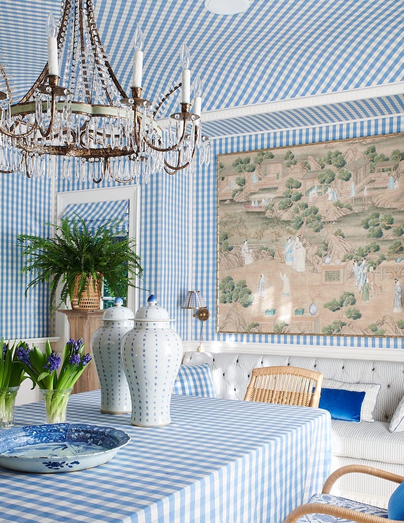
No. 2 Pairs & Balance
Balance and symmetry are key principles of classic design, and they are so important to styling. A room's layout should never physically feel lopsided nor should the design scheme's color, patterns, or accessories. When you add blue and white to a room consider how it connects with the rest of the space. Is it a jarring note or a harmonizing one?
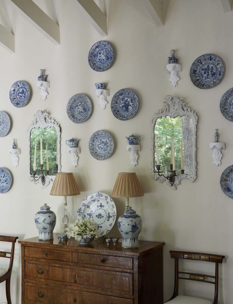
Work to arrange blue and white on shelving, a mantel, or a console in a pleasing way that feels balanced if not symmetrical. Any time you can, I encourage you to buy in pairs to utilize symmetry and create rhythm by repeating elements throughout a space. This doesn't mean you should go for rigid linear order.
This shelf design from the ever fabulous Bunny Williams is a beautiful example...
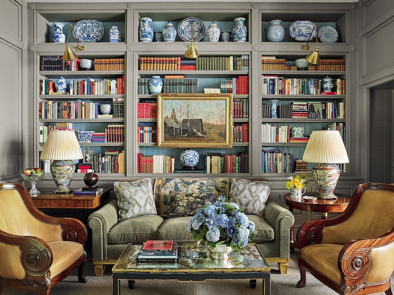
Manhattan East Side Townhouse, Designed by Bunny Williams, image via 1st Dibs
No. 3 Variety Is Interesting But A Collector Has Qualifications
So you love blue and white ceramics, which ones? Dutch Delft? Chinese porcelains? English transferware? Iznik fritware?
The use of blue and white ceramics is more effective when presented as a collection that has some cohesion and rationale. I'm not saying don't buy what you love, but think about why you love it and which details specifically draw your eye! Then use that self-awareness to build a more meaningful and pleasing collection.
Yes, you absolutely can make these ceramics from different origins work together, but blind acquisition often ends up a jumble! Shop my collection of blue and white here!
No. 4 Moderation
Edit...edit...edit...a few key pieces can be more dramatic and more powerful than a chaotic jumble of mismatched designs and forms of poor quality. See No. 1 Quality Matters!
I love how Lilse McKenna used these large Chinese chargers on the wall as a statement. The blue and white shines against the textured floral wall and feels elegant but not stuffy.
No. 5 Warm It Up
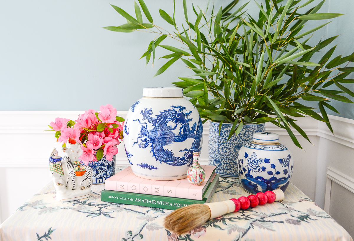
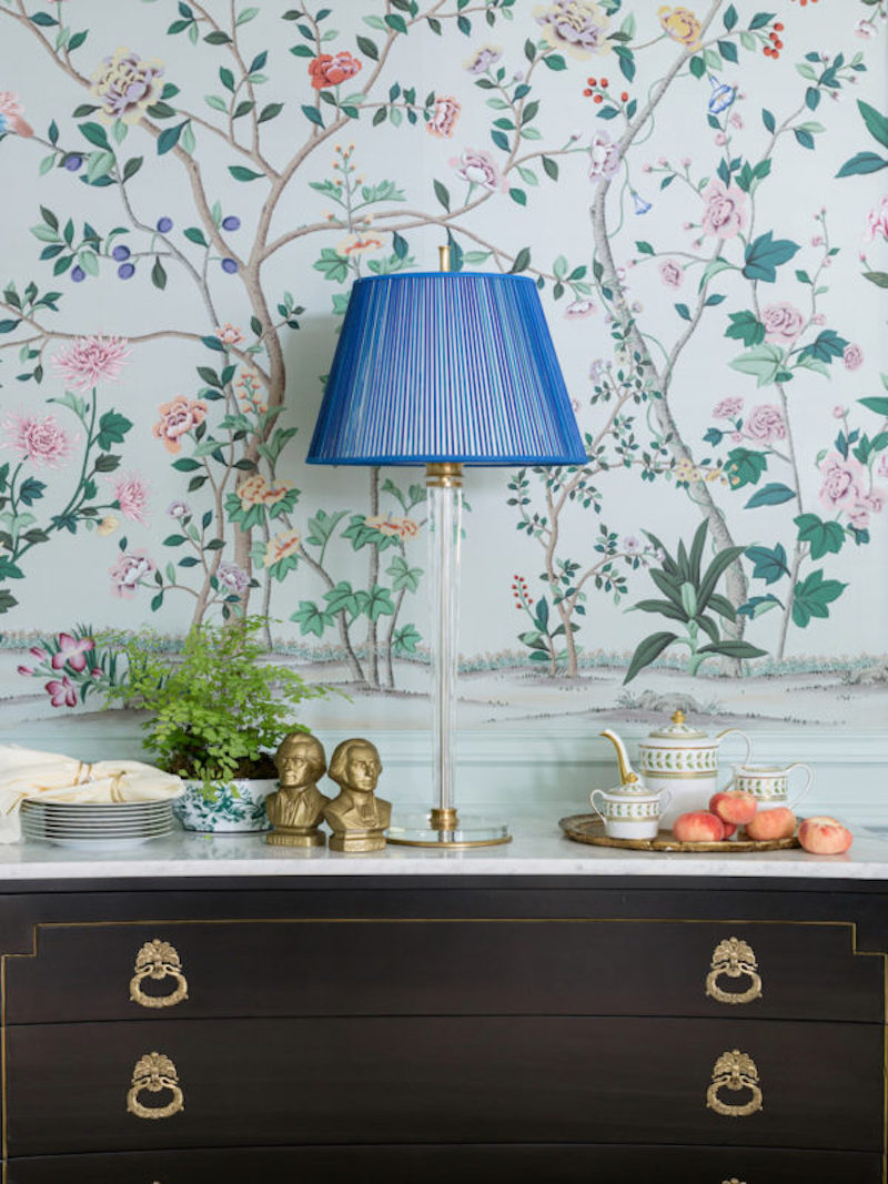
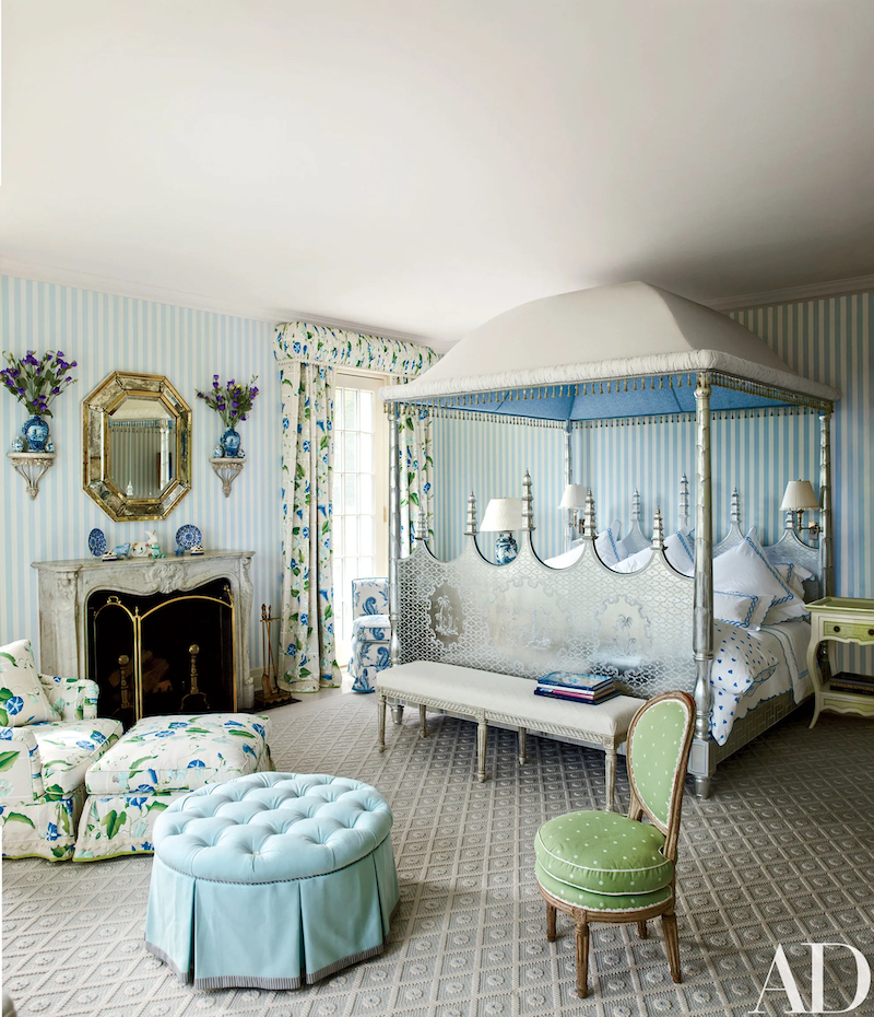
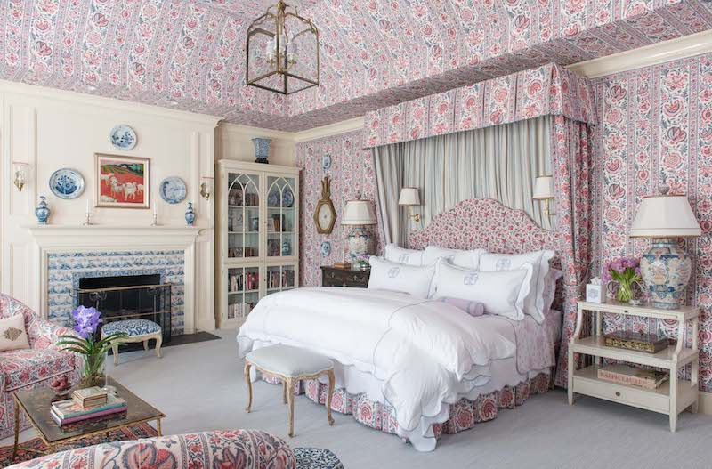
Blue is a cool color and when used throughout a room it can give the space an icy feel. The white is a crisp bright neutral and is not necessarily helpful in toning down the frigid feel. So when decorating with blue and white always warm it up with colors like yellow, red, orange, and pink or try surfaces in rich gold or lustrous wood tones like mahogany or cherry.
No. 6 Sky & Cloud Meet Sand
This color duo isn't just a cooling combination it can also feel too airy with its allusions to sky and cloud and too severe with its high contrast. To counteract this it is important to ground the scheme by using soft taupes and browns that add texture. Mark Sikes does this exceptionally well adding sisal rugs, wicker, and coarse linens to almost all of his blue and white rooms.
Black furnishings and decor is another way to ground the duo and ease the high contrast. Think black lacquer, marble, or metal finishes.

No. 7 All Shades of Blue
Blue is one of those colors that really excels when layered in different shades of itself. You can design a whole room or even a house in various shades of blue. My favorite blue on blue mix is the deep cobalt of Chinese porcelain with a soft shade of aqua.
With that said, you've got to add in other neutrals and loads of texture for it to work.
No. 8 Layered Antiques
Blue and white still looks best when layered with antiques and 18th century design forms. Its visual history as a decorative art matters.
No. 9 Visual Respite
When creating a space in this color duo, it can be very tempting to utilize pattern on pattern in the color scheme. But that often leads to over stimulation and visual fatigue. Be sure to incorporate solids in blue or white. You can still have multiple patterns and layer them just give the eye some areas of rest.
Speaking of pattern, I am so tired of seeing cheap chevron or rigid trellis prints with these ceramics. It's like Charlie Brown's t-shirt meets Watteau Rococo. Bleh!
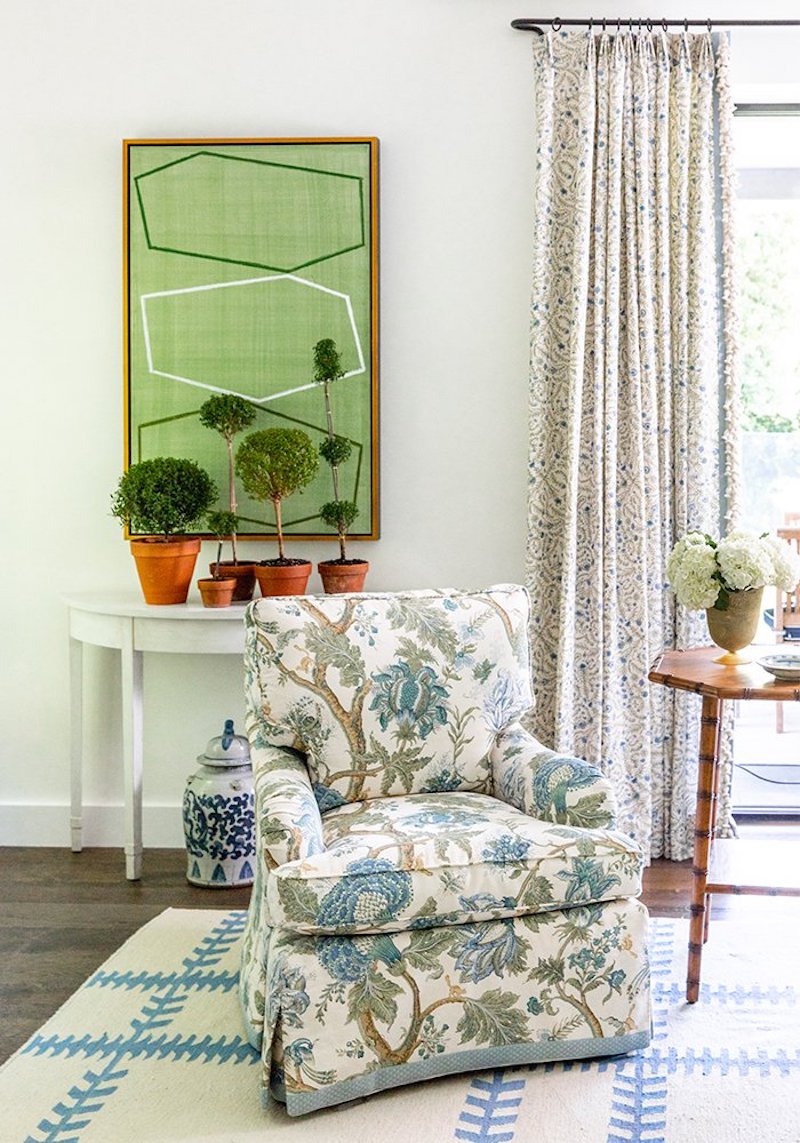
No. 10 Blue Loves Green
In No.s 5 & 6 I mentioned that this pairing can feel too airy and cold, if not warmed up and grounded. Another way to combat that is by bringing in green either with hues of green or living plants. Green feels vital and fresh, which will keep blue and white from becoming too aloof.
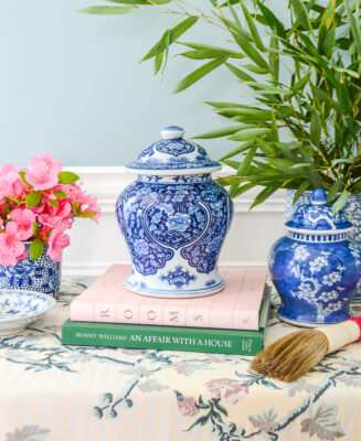
A simple palm leaf or stem of bamboo tucked into a blue and white vase or jar can be enough!
There you have it...my 10 keys to decorating with blue and white, either as a color scheme or the ceramics, in a traditional way that banishes the trend. Now some of you may wonder...if following these rules results in visual fatigue and boring uniformity? In my opinion, understanding and observing classic design tenets doesn't negate creativity.
There is a world of nuance in the possible interpretations of any of these tips, and as the masters of blue and white like Mark Sikes, Furlow Gatewood, Carolyne Roehm, Mario Buatta, and Cathy Kincaid show no matter how many times they embrace blue and white each iterations is distinctive.
Here is a look at some of my favorite blue and white spaces and vignettes that never cease to inspire me:

Looking for quality blue and white ceramics? Shop my collection here!
Hi there! I'm Katherine...

the curator, writer in residence, and decorator behind Pender & Peony.
I’ve decorated my entire 1960s brick colonial with secondhand finds and antiques on a budget without sacrificing style, quality, or comfort.
You CAN have a traditional home with timeless charm on a budget too!
The problem isn't your taste -- it's an industry that glorifies the next big trend and only showcases high end custom design.
That's why I created The Collected Room Method to teach you my approach to the collected interior!
Hi Catherine!
I just had to comment on this Blue/White decor (Chinoiserie) craze..
I don’t mind saying that it is becoming a BIT overdone. Just the plain blue/white sans other colors to offset. Having said that, I will admit that I was one of the first, so many years ago to decorate heavily w/my grandmothers Blue Willow collection w/some Canton and Flow blue, as well. I have ALWAYS loved it and my grandmother knew that. I even had teeny, tiny tea sets as a child in the Blue Willow pattern. I have some very unusual, very old and very expensive pieces, both from my grandmother and from what I have added over the years. Now, I also must say that IF I was a young gal, just starting out and had JUST fallen in love w/the “blue/chinoiserie” look, then I might be tempted to load up at TJ Max and Home goods and the like to get started due to the fact that vintage/antique pieces are priced as the market will bear. The newly starting out girls of today can’t afford the prices of the much sought after vintage/antique Blue and white Chinese and English wares. Most did not get a head start from a grandmother! I think it is fine to “decorate” with these store finds and begin a “collection” as money allows, bit by bit, gradually replacing the NEWLY mass produced decor and hobby store pieces with a collection of beautiful vintage and antique wares.
BTW, I love that in YOUR decorating that you add the pinks, reds, greens to the blue. THAT is so much trickier than JUST going blue/white entirely..!
Hey! Thanks for sharing your perspective. How wonderful to inherit such a lovely and timeless collection from your grandmother. We should all be so lucky. I guess we will have to agree to disagree…I think blue and white Chinese porcelains are worth the investment. Why spend money on something without real value that your going to throw out in a few years? There are so many sources for affordable vintage and antique options here on IG, eBay, Etsy, etc. that you really can find decent prices on Chinese porcelain, blue willow, Spode, Wedgwood, etc. Then if you’re willing to do a bit of hunting– estate sales are full of the stuff!
Thanks! I agree…blue and white is more visually interesting when paired with the rainbow!