
Style Advice for Choosing a Rug
Choosing a rug requires many key decisions from material and size to style! Learn about the four main styling elements to simplify those decisions and decorate with rugs successfully!
The character of a room is instantly elevated by the addition of a stylish rug. Rugs can inspire a room design or be the finishing touch that pulls a room together. Rug choice really depends on the look you are trying to achieve and the feeling you want to bring to a room.
In general, I do not believe your rug has to be an exact match for the color and pattern of a room design. Instead focus on creating harmony between the furnishings and flooring. Too matchy-matchy of a look can make a room feel straight out of a catalog or overworked.
When choosing a rug, there are four main styling elements to consider:
- texture,
- pattern,
- color,
- and spatial definition.
Let’s take a look at each of these considerations and see some examples!
Considering Spatial Definition
The first detail to consider when decorating with rugs is where it is going and how big the rug should be. Rugs are key in defining spaces i.e. delineating a seating group, drawing attention to a coffee table, or leading you in a certain direction.
The spatial purpose for the rug will dictate its size, and it is much easier to begin shopping for rugs when you can filter by size. I’m not going to discuss rug sizing here. There are tons of helpful guides already out there. Look at this one from Rug & Home.
But maybe you are wondering what I mean by spatial definition, let’s look at some examples:
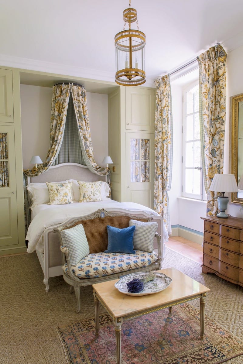
Le Mas Des Poiriers Bedroom Image via The Glam Pad
In the charming bedroom above we have a layered rug situation with a jute or sisal rug covering most of the floor then a small Oriental rug creates an accent underneath the coffee table. This helps distinguish the seating area from the bed and draw our eyes to the table.
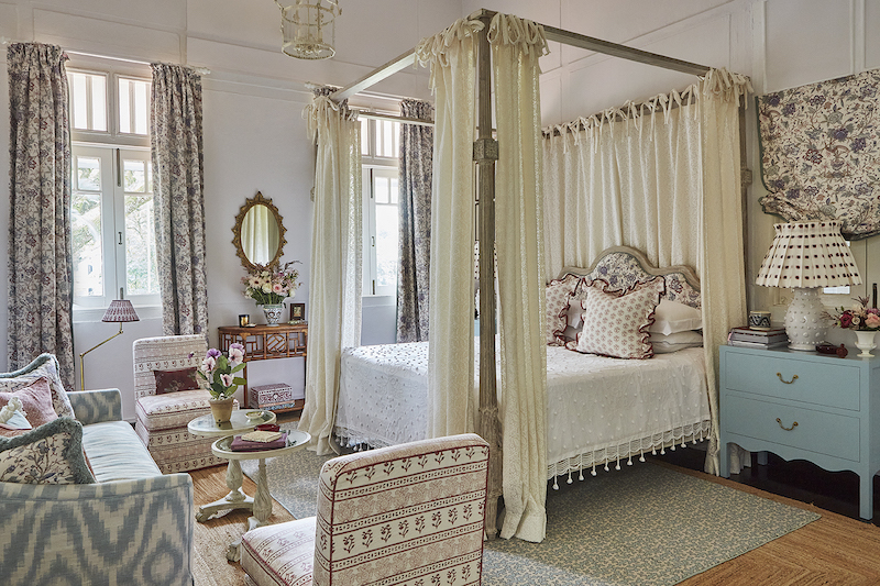
This bedroom is again about a layered look, but here the blue and white rug highlights the bed zone.

James Farmer Image via HGTV
Rugs don’t just define spaces, they can also lead you through a space just think of the effective runner! Here in this galley kitchen the rug helps emphasize the elongated space and leads the eye to the dining room.
Considering Rug Texture
Rugs are a wonderful way to add texture to a space. Rugs tend to be a wooly or knobby texture, but generally the longer the nap the more fuzzy and tactile a rug will feel. This doesn’t mean you have to go for the 70s shag. Jute and sisal fibers are a great choice for adding a natural texture.
Why do you want to add texture to a room? Think about how you would feel in a room with nothing but glossy mirrored surfaces. Ick… right? For most of us it would be uncomfortable and not very cozy. Textural variety in a room is key to bringing the cozy! Your toes will also thank you!

Most of the surfaces in the above study are flat or polished with the smooth wallpaper, lacquered desk, glass lamp, and linen upholstery, but the knobby chevron rug adds depth and warmth, which balances out the cool tone walls.
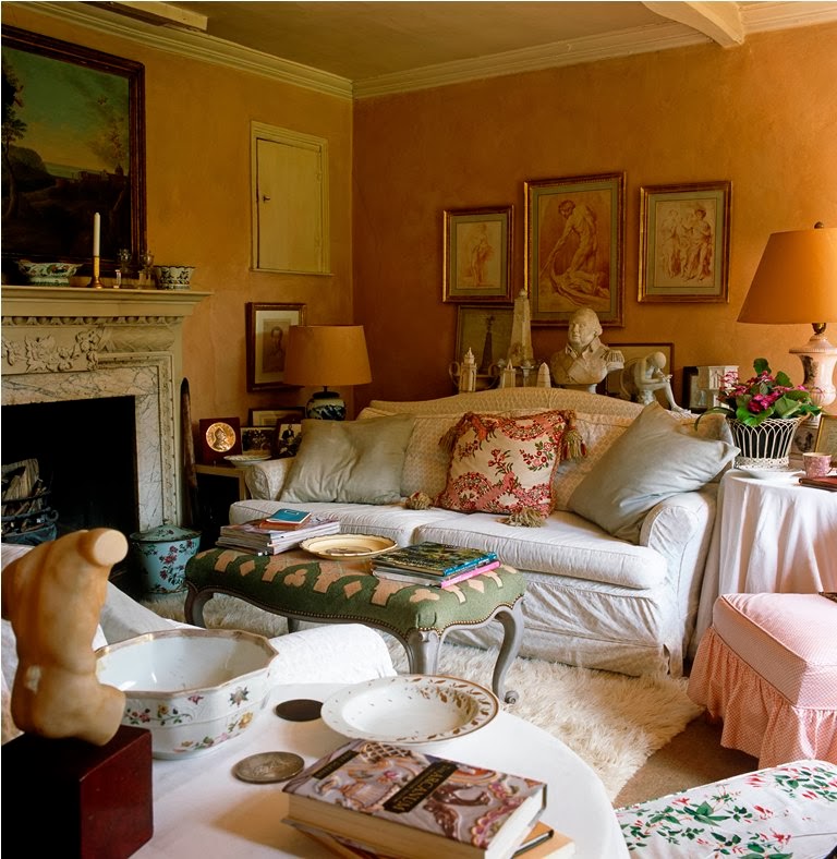
Nicky Haslam via Shabby Chic Mania
The cozy casual vibes of this sitting room are enhanced by that white shag rug!
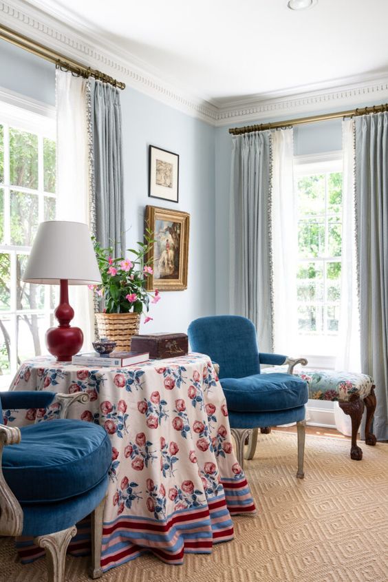
Considering Rug Color
Choosing a rug with the right colors for your room design is probably the most tricky part of the process. Harmony is the key concept I want you to embrace!
The rug needs to harmonize with the other colors in the room, but it doesn’t necessarily have to be an exact match. If you start closely observing traditional historic interiors, you will find that Oriental rugs in classic red hues are used religiously no matter the other colors and it works!
If you need or desire more color cohesion, coordinate accent colors in the room with at least two or three colors from the rug.
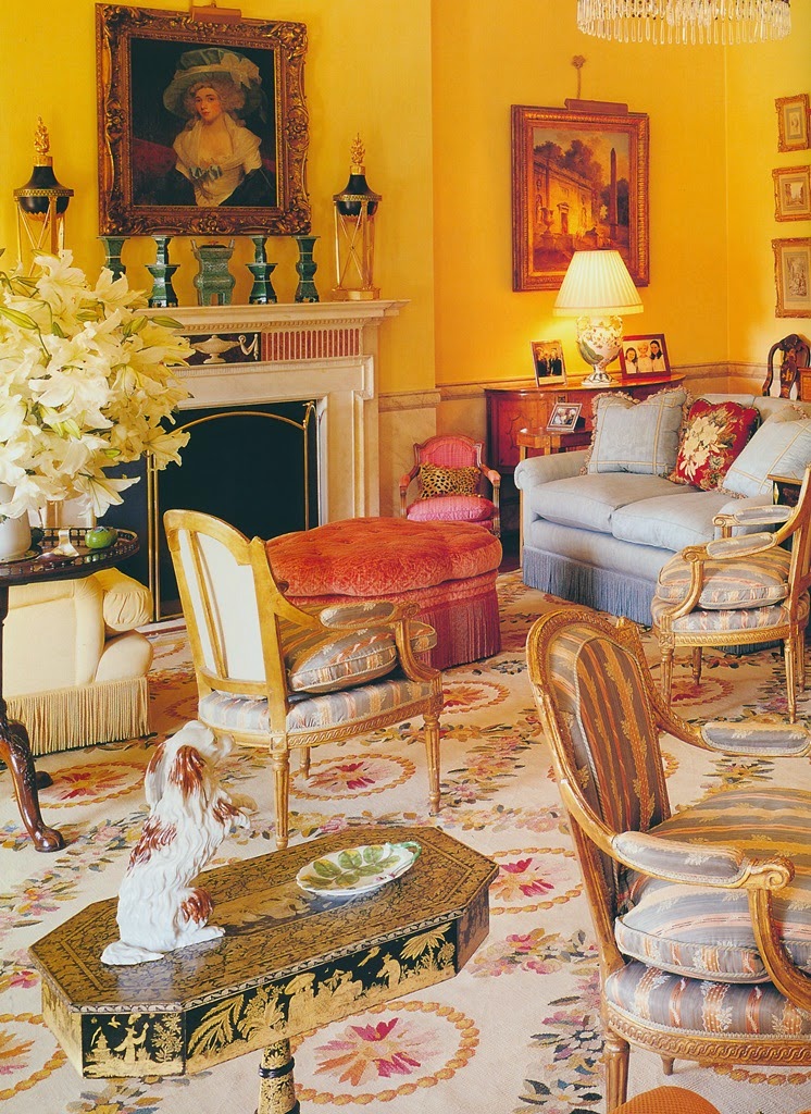
Carroll Petrie Image via The Peak of Chic
In the parlor above, we have near perfect color harmony between the furniture upholstery colors and the rug’s tones. You can see that the pale blues coordinate, the deep pink matches, and the golden yellow in the rug is a softer more muted version of the walls. This room begs the question…which came first? The rug selection or the furniture?
A rug is not a bad place to start for design inspiration, especially if you want more color cohesion.
Rupert and Anna Bradstock Image via Curated Interior
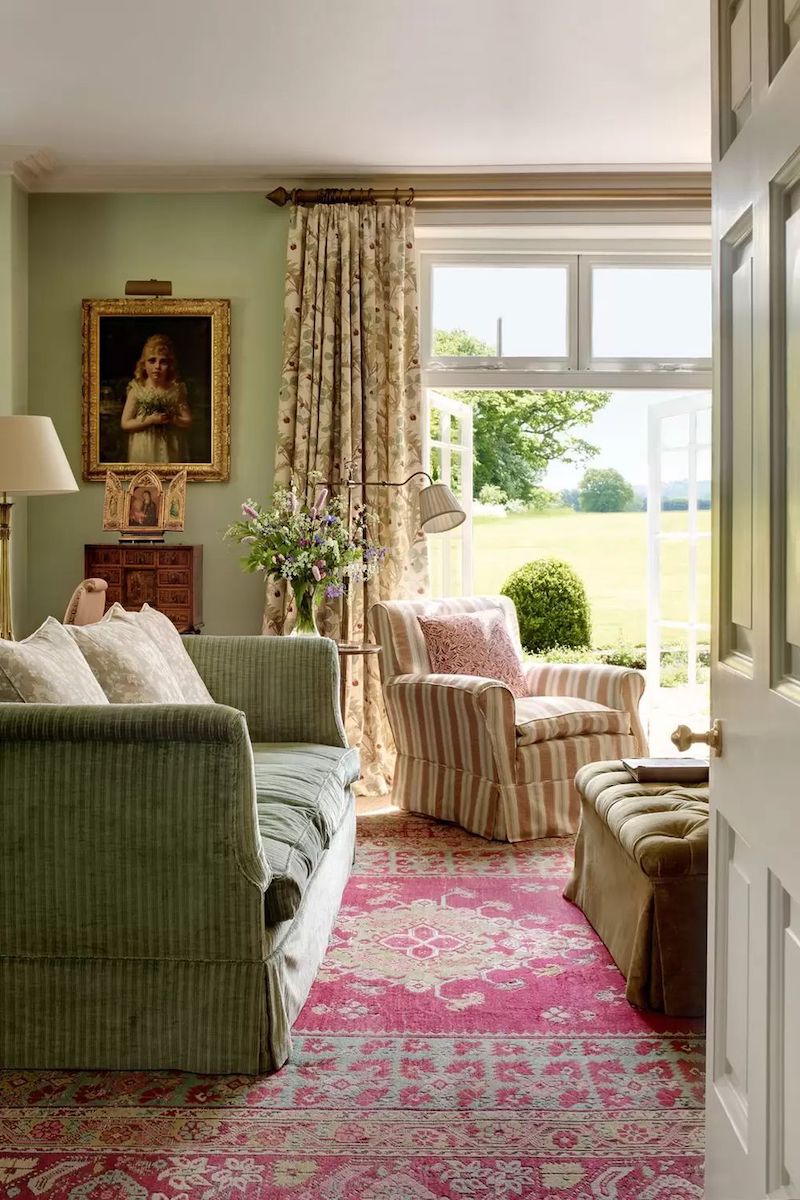
Contrast, however, can also be the purpose of a rug. Contrast doesn’t necessarily mean drama, but rather it can be a way of balancing a room. In the green room above that red rug warms up and enlivens the pale green hues. Red and green are complementary colors, meaning they are on opposite sides of the color wheel, so they are in tension with each other. But the tension can help make a room more interesting and appealing.

This dining space from Miles Redd is charming, and he kept the room from becoming a pastel mecca by balancing the pale blues and pinks with deep reds, teals, and greens — primarily from the Oriental rug.
Contrast is at work in this sitting room too. But instead of a bold rug, we have a neutral wheat tone that balances the vibrant greens and blues. The key to decorating with rugs and using contrast is that harmony is still the goal! It is just not harmony in terms of matchy-matchy.
Considering Rug Pattern
Rugs are a wonderful opportunity for layering in patterns. There is a huge variety of patterns available — everything from paisley to floral and stripes to polka dots. Because of this vast selection, choosing your rug pattern can be difficult to narrow down.
Here is when you should go back to the original design scheme and stick with the style and feel you wanted for the space. Certain patterns are endemic to certain looks and will help you achieve that style, so don’t try to re-invent the wheel.
Once you focus in on a pattern or two, here are some questions to consider:
- Does the rug pattern coordinate with the other patterns in the space? Does it make the room too chaotic?
- Is the pattern multi-colored and does that make it too busy?
- Is the scale of the pattern fitting with the room size?

Reading Room via Classy Girls Wear Pearls
This reading room is full of cozy charm. Most of the room features solid colors or small soft patterns, so the boldly patterned rug brings the interest without feeling like too much.
Mark D. Sikes Image via The Glam Pad
Remember pattern doesn’t have to be multi-colored. Sikes has upped the pattern layering in the above seating area with a diamond pattern rug, but in a solid color. Again it’s about the balance!
If you are working with a large scale room that has high ceilings and multiple seating areas, go for a large scale pattern. The room can support it, and it will help the room feel proportional.
I hope these four styling considerations will help you choose a rug with more ease! See my picks for Grandmillennial rugs in this post!
Hi there! I'm Katherine...

the curator, writer in residence, and decorator behind Pender & Peony.
I’ve decorated my entire 1960s brick colonial with secondhand finds and antiques on a budget without sacrificing style, quality, or comfort.
You CAN have a traditional home with timeless charm on a budget too!
The problem isn't your taste -- it's an industry that glorifies the next big trend and only showcases high end custom design.
That's why I created The Collected Room Method to teach you my approach to the collected interior!