
My Favorite Paint Colors for Grandmillennial Style
A look at the best paint colors for Grandmillennial style from Benjamin Moore and Sherwin Williams.
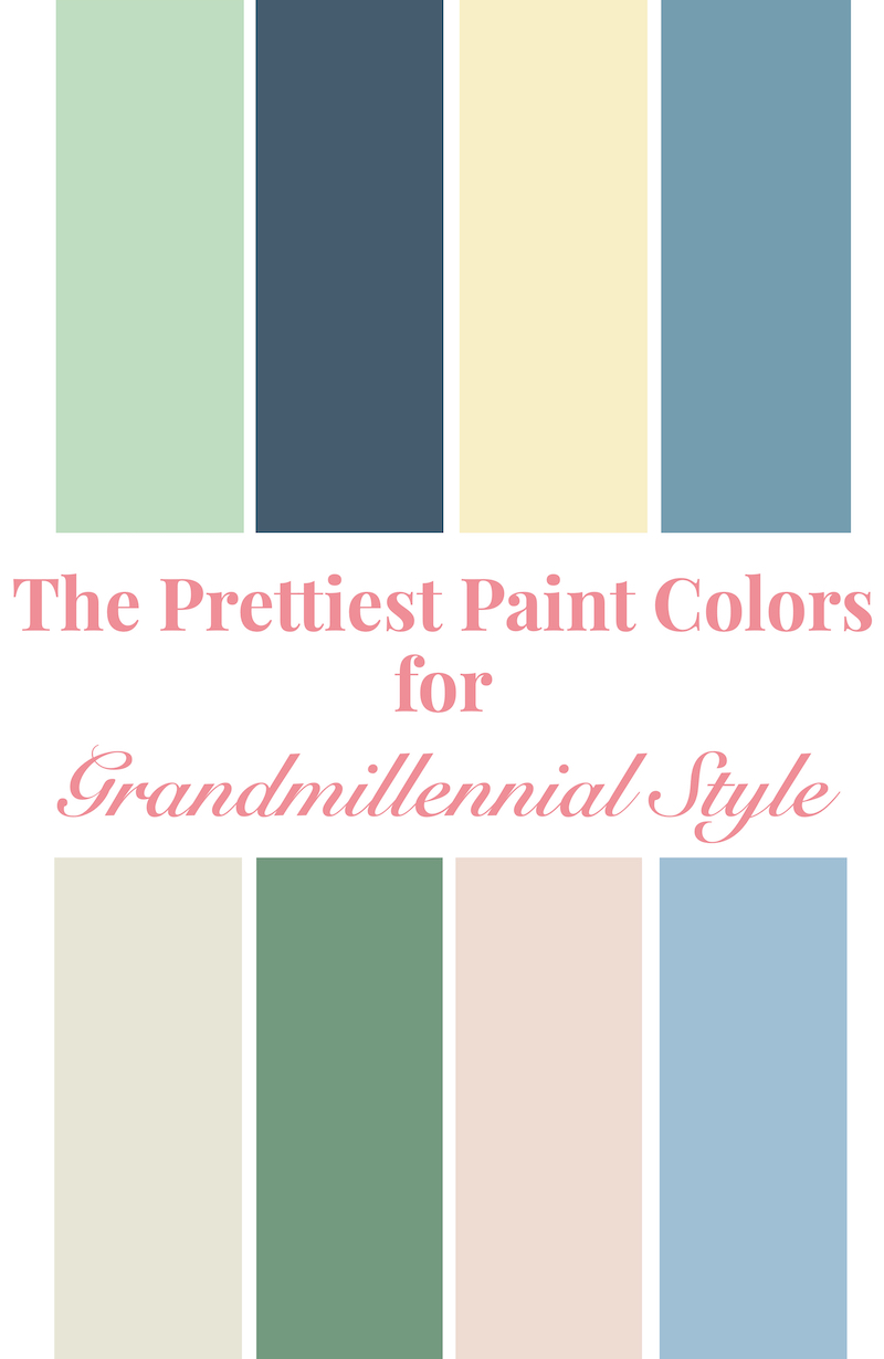
Colors above: Cucumber Salad, Van Deusen Blue, Candlelit Dinner, Niagara Falls, Seashell, Clearspring, Sugarcane, Sapphire Ice
So you are ready to move on from the over-done farmhouse grays and earthy browns? Ready to embrace colorful walls and bright, fresh hues?
Was that a resounding YES? I thought so!
If you’ve been charmed by the interiors of Clary Boysbyshell, Ashley B. Hanley, or Caitlin Wilson then it’s time to test out the pretty color palette of the Grandmillennial!
As a self-proclaimed Grandmillennial decorator who gets to test out lots of paint colors for clients, I’ve honed in on the loveliest paint colors of the Grandmillennial look, and I’m sharing my favorites with you today.
The Grandmillennial palette is characterized by fresh, vibrant hues that have a bit muddier tone to them. They feel traditional but not staid…bright but not garish.
Pretty Paint Colors for Grandmillennial Style:
BM – Benjamin Moore
SW – Sherwin Williams
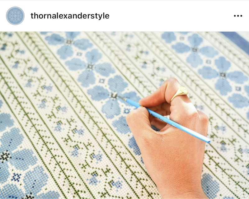
Image via @thornalexanderstyle
Wedgwood Blue
Colonial Teal
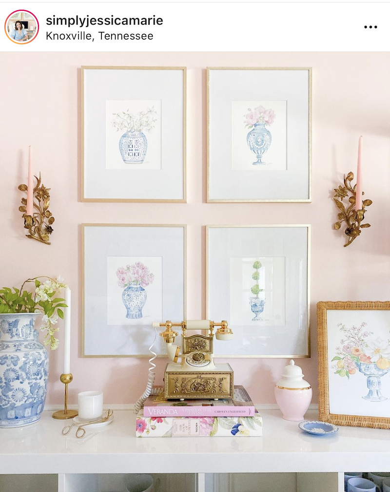
Image via @simplyjessicamarie
Blush Pink
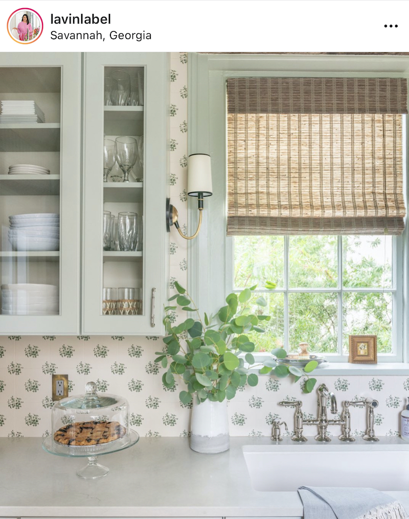
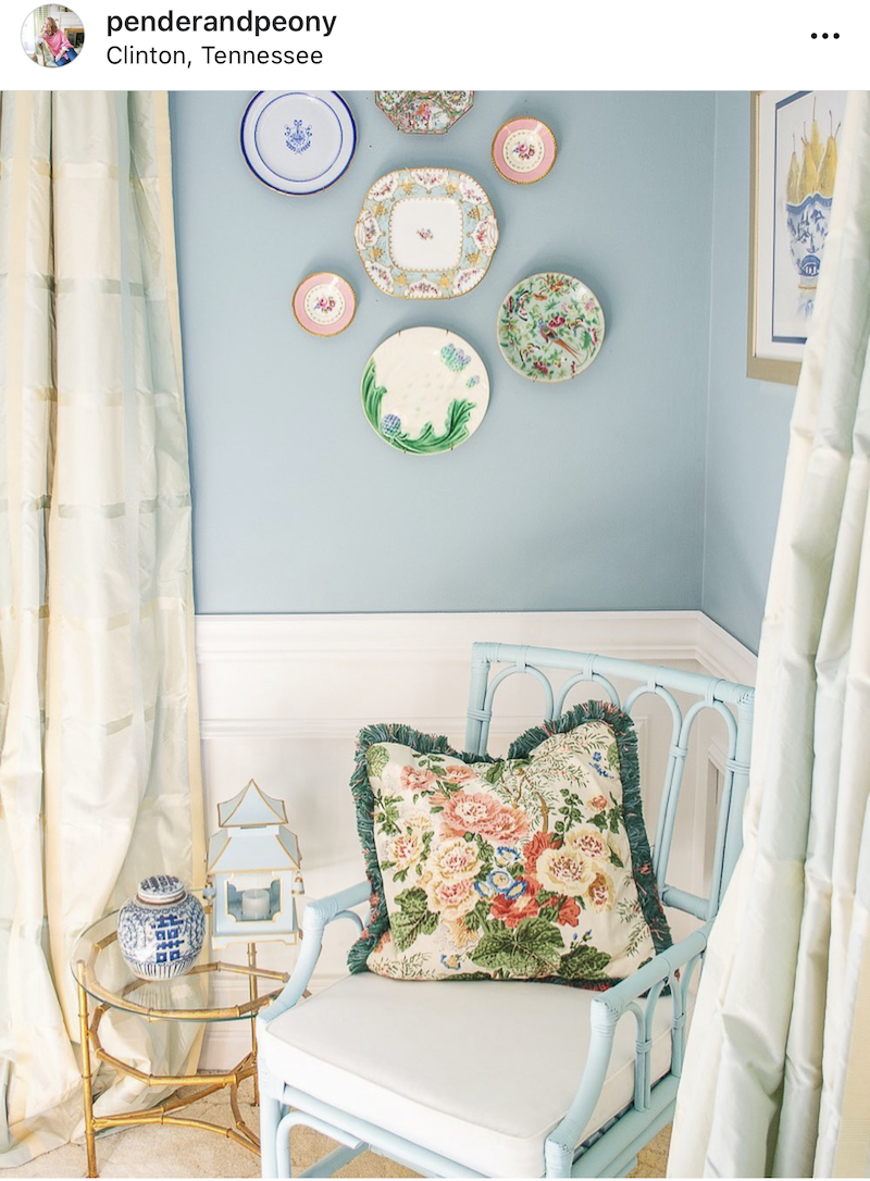
Image via @lavinlabel
Sage
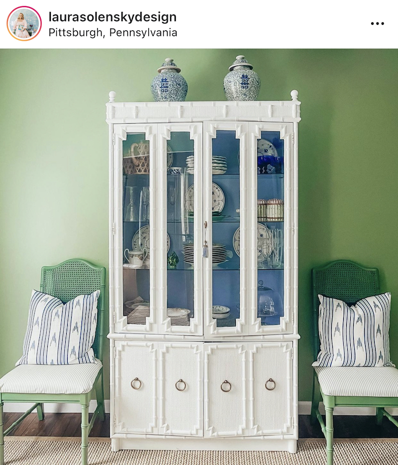
Image via @laurasolenskydesign
Soft Jade
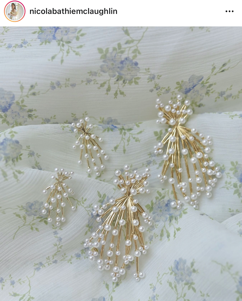
Image via @nicolabathiemclaughlin
Pearl
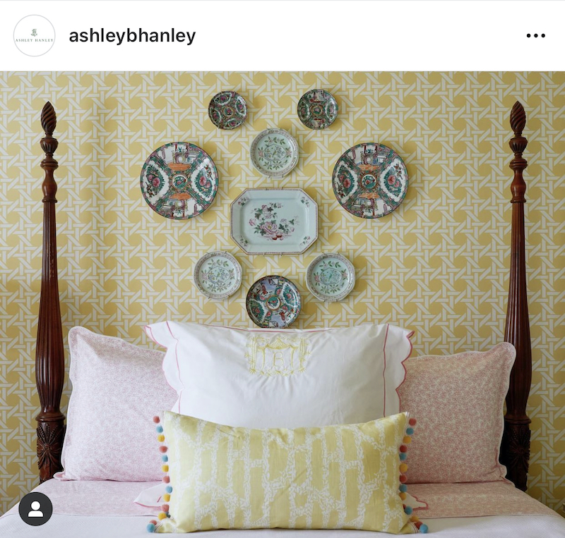
Image via @ashleybhanley
Lemon Sorbet
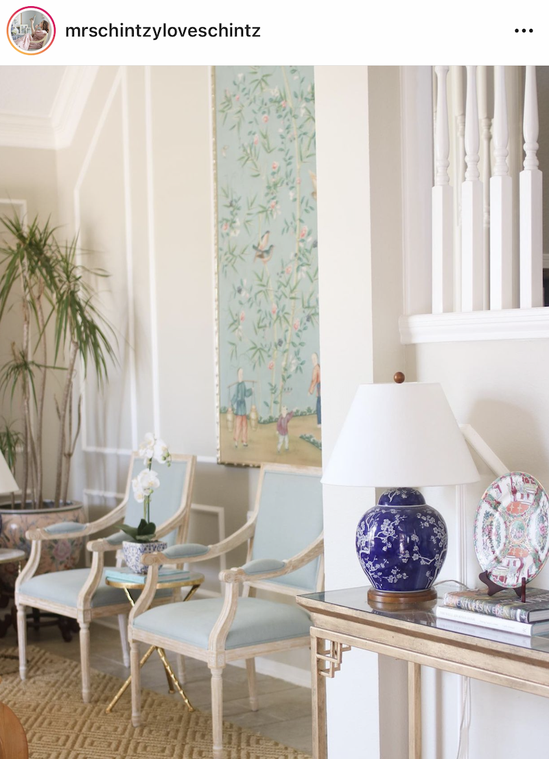
Image via @mrschintzloveschintz
Natural Wicker

Image via @theenchantedhome
Cobalt
Now don’t rush out and buy a gallon of one of these hues. Paint colors are always affected by the unique lighting situation in a room and the other color pairings. I recommend painting a swatch on a piece of white poster board then taping it to the wall to see how the artificial and natural lighting you have impacts the paint color.
For my particular advice on decorating with a specific color, see these posts:
Hi there! I'm Katherine...

the curator, writer in residence, and decorator behind Pender & Peony.
I’ve decorated my entire 1960s brick colonial with secondhand finds and antiques on a budget without sacrificing style, quality, or comfort.
You CAN have a traditional home with timeless charm on a budget too!
The problem isn't your taste -- it's an industry that glorifies the next big trend and only showcases high end custom design.
That's why I created The Collected Room Method to teach you my approach to the collected interior!