
My Advice on How to Decorate with Blue
Are you a lover of blue hues in your home decor? Considering painting your walls in blue? Read my advice on how to decorate with blue to avoid costly mistakes!
Ah…the beauty of blue! It is one of those colors that always feels clean and bright no matter if it’s in its deepest bold navy or palest hue. Blue is a versatile color with almost universal appeal — you can dress blue up for formal spaces or soften it for casual bedrooms. It can go intense and striking or serene and neutral.
If you are into the Grandmillennial interiors movement, you have probably noticed it everywhere lately! I would dare say blue rules in Grandmillennial color schemes. Just think of the spaces by Clary Bosbyshell or Sarah Bartholomew. Read this post for more on Grandmillennial tips for blue.
I am a particular fan of decorating with blue, and I have painted 4 rooms in our house in various shades of blue. There’s a few things I’ve learned using blues in my own home as well as helping clients decorate with this hue.
How to Decorate with Blue
According to color psychology, blue creates feelings of trust, serenity, and confidence. If you are not careful though, it can become icy, making a space cold and impersonal. Alternatively, the wrong blue can look too youthful, calling up stereotypical allusions to baby boy nurseries.
To avoid these pitfalls pay close attention to the room’s orientation, the shade’s undertones, and your color pairings. First observe the orientation of the room you are decorating. Does it face north, south, east, or west? If it faces north to east, you will have cooler light pouring through the windows and should consider using blue shades with warmer undertones. If the room faces south to west, you can use cooler blues.
What are undertones?
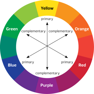
When a color is made by mixing two+ colors together that color will have both a primary tone and an undertone — an underlying color that creates that turquoise (combining blue and green) or magenta (combining red and blue). Your eye perceives the primary tone that tells you the color is red, blue, green and so forth, but the undertone often affects how warm or cool that color feels. Some blues will feel warmer than others because they lean more to the purple red side and others feel more cool because they lean to the green side.
If you ever picked out a white paint color you thought was crisp white then got it home to discover it has a yellow or pink tint, you’ve observed the power of undertones! Your lighting source (natural vs. incandescent vs. fluorescent) can have a major impact on this tint too, which is why you must consider the orientation of your room. Read more about undertones here.
Colors can also have a muddy appearance depending on how much gray is added to them. The more gray the more earthy the color feels. I highly recommend choosing blues with this muddier appearance for paints because this will help you avoid that bright blue sky look or the allusions to nurseries.
Some of my favorite blue paint colors are:
Tranquil Blue – Benjamin Moore
Palladian Blue – Benjamin Moore
This is the wall color in my family room and master bedroom
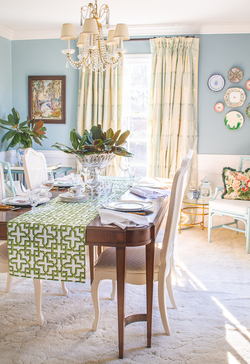
Interesting Aqua – Sherwin Williams
This is the wall color in my dining room and powder room
Color pairings
The colors you pair with blue can be key to avoiding those pitfalls we discussed earlier. If a room is feeling too icy, it probably needs some warmer elements to balance that icy blue hue. Yellow and orange are the classic choices, and you can find countless examples of a blue and yellow color scheme out there for inspiration.
But for a more grandmillennial approach, I recommend warming up your blues with pink shades, gilt accents, and/or rich wood tones. Avoid grays and silvers because those add more cool tones, and those color combos feel farmhouse or even glam with the right furnishings.
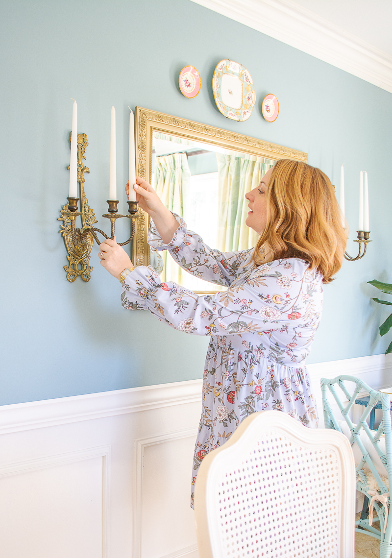
In my dining room I added gold accents with the mirror, sconces, and chandelier to warm up the blue walls. See more of my dining room in this post.
Blue Themes
Traditionally, we see blue used often in coastal or country themed spaces. If you want to avoid those themed looks that feel “dated” pay close attention to the patterns and accessories you are using with blue. Opt for more “neutral” themed patterns that don’t feel country or coastal.
Small scale romantic florals, especially if paired with gingham, can create that country feel, so choose carefully. Stripes are another classic pattern that can go coastal quickly when done in blue, so be careful of adding in coastal themed accessories if that is not your goal.
If you want to decorate in a contemporary coastal theme, look to the vibes of Serena & Lily, and if you want to decorate with a country flair but in a contemporary way, look to the designs of James T. Farmer.
——
I hope my advice on how to decorate with blue gets you started using this color with confidence. In all honesty, I think blue is the easiest color to decorate with because of its versatility and universal appeal. Want more on using blue in your home? Check out this post on decorating with blue for Grandmillennial style!
For more of the color series, see this on how to decorate with pink and this post on using green.
Hi there! I'm Katherine...

the curator, writer in residence, and decorator behind Pender & Peony.
I’ve decorated my entire 1960s brick colonial with secondhand finds and antiques on a budget without sacrificing style, quality, or comfort.
You CAN have a traditional home with timeless charm on a budget too!
The problem isn't your taste -- it's an industry that glorifies the next big trend and only showcases high end custom design.
That's why I created The Collected Room Method to teach you my approach to the collected interior!